ShopGoodwill
Redesigned ShopGoodwill's navigation — dropped Favorites Tab time by 89% and surfaced a second problem the redesign hadn't accounted for.
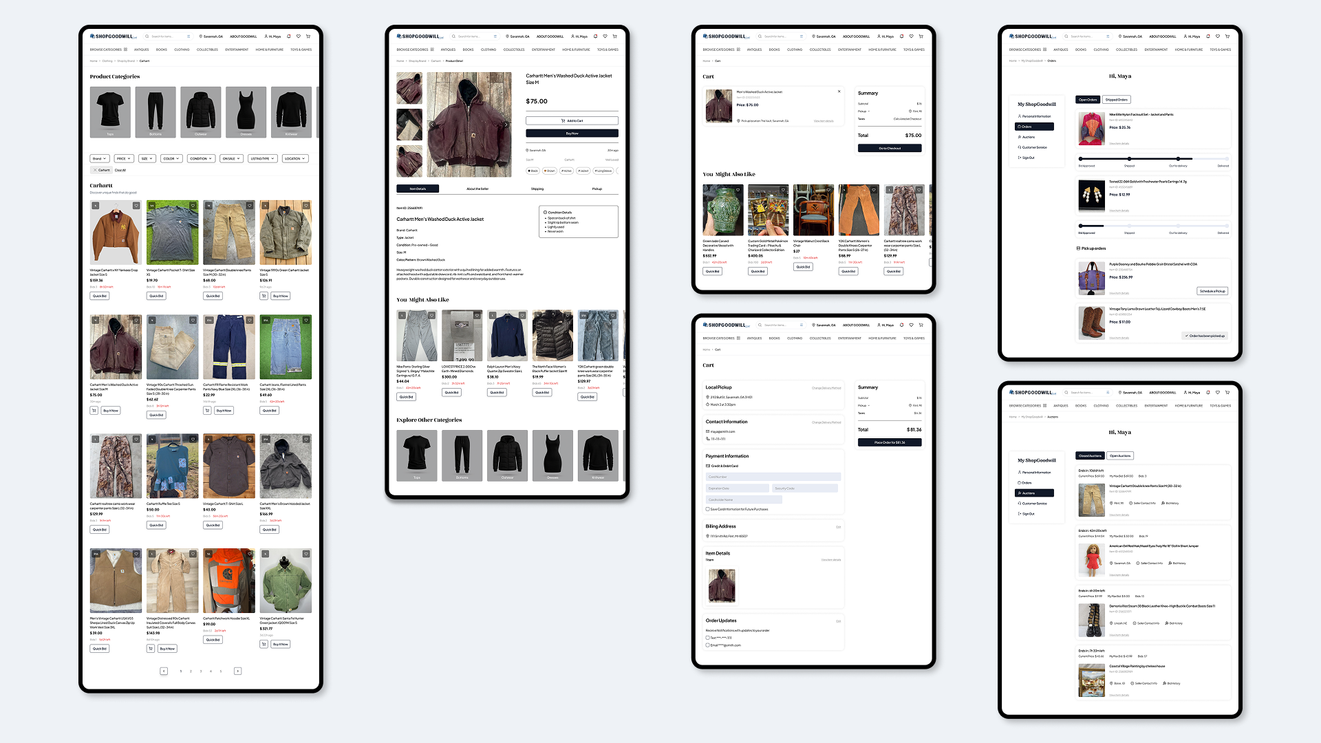
Problem Space
Our target users were first-time secondhand buyers aged 18–29, already fluent in Depop, Poshmark, and eBay patterns. Two structural issues on ShopGoodwill prevented users from browsing efficiently and saving reliably. The 200+ product categories sat in a flat vertical list with no hierarchy, so users had to already know where something was categorized to find it. Search often failed to return results because of exact-match spelling, which left the flat list as the only fallback. Separately, the Favorites heart icon and Favorites tab weren't where users expected them — they didn't match the mental models users carry from other e-commerce platforms.
My Role & Constraints
My Role
Phase 1 — Planned all primary research. Designed and built the tree testing tool with Drake Durflinger. Owned tree test synthesis and IA iteration. Designed the categories navigation menu. The filtering UI and location finder were not mine.
Phase 2 — Project manager. Owned the unmoderated Maze study end-to-end — study design, participant filters, task scripts, data review. Moderated three user tests and gathered the time-on-task and error metrics across all nine sessions that guided redesign direction. Did not design the prototype.
Team
Phase 1 — Team Thrifty: Kate Besel, Chloe Rankin, Drake Durflinger, Jeong Cho, Kylia Agostinelli.
Phase 2: Kate Besel, Martina Viteri, Alyssa Portnoy, Joaquin Gordillo. All four conducted individual heuristic evaluations; moderated sessions were distributed across the team.
Constraints
The Phase 1 prototype wasn't finished until the final week of the quarter, which pushed visual-redesign testing into Phase 2. In Phase 2, the prototype's cart page was non-functional, limiting how cleanly we could interpret task failure in the unmoderated study.
Phase 1 — Structure, Not Labels
A closed card sort tested ShopGoodwill's flat category structure against how online shoppers actually group products — and it didn't hold up. Participants felt overwhelmed by the sheer volume of categories, dismissed catch-all buckets like "Bulk" and "Miscellaneous" as meaningless, proposed merges the old hierarchy kept apart, and noted that several "subcategories" behaved more like search filters than navigation labels. That reframed Phase 1 from a labeling exercise into a structural rebuild, anchored in users' mental models rather than the existing labels.
No existing tree-test tool fit both ShopGoodwill's 200+ categories and a student budget — UXtweak capped at 15 responses, Optimal Workshop ran $199/month — so we built one that captured everything the paid platforms did. V1 (n=12) exposed two structural weak points: Books was buried under Entertainment, where the math-textbook task drew just 25% direct success, and a persistent Antiques-versus-Collectibles ambiguity sent users backtracking across the catalog's hardest items. Elevating Books to its own top-level category was my call, and V2 (n=7) confirmed it. But the second round wasn't a clean sweep — a diecast model and an old-world map both dropped to 0% direct success, confirming the Antiques/Collectibles split as the deeper structural problem. We'd have run another round of card sorting to pin down the mental models behind it, if the class timeline had allowed.
Books, V1 → V2
A structural decision validated by the data — and the project's clearest single data point.
Math Textbook task
Books elevated from under Entertainment to a top-level category
Phase 2 — Testing Against a Competitor
Phase 1 ended with a restructured site map and a redesigned prototype that hadn't been user-tested. Phase 2 picked up that validation gap: could first-time users in the target demographic actually operate the redesign against a platform they already trusted? We started with a heuristic evaluation to choose the test flows, then ran two studies: moderated testing against Depop to benchmark finding items and adding to favorites, and unmoderated testing on the redesign to evaluate our solution.
On the moderated side, participants saved items and located the Favorites Tab on both ShopGoodwill and Depop. It took participants an average of 23.77 seconds on ShopGoodwill and only 7.6 on Depop. We found the same gap when users added items to favorites: 34.44 seconds on ShopGoodwill vs. 18.14 on Depop.
ShopGoodwill vs. Depop
Time-on-task, moderated usability testing. Two identical Favorites tasks on each platform.
Favorites Tab
Time to locate saved items
Users took more than three times as long on ShopGoodwill as on a direct competitor.
Favorites Icon
Time to locate save action
Same pattern on the save action — roughly twice as long to find as on Depop.
I then designed and ran an unmoderated Maze study on the redesigned prototype, matching the moderated tasks for a clean before/after comparison. The navigation redesign worked: participants located the Favorites Tab in 2.5 seconds, down from 23.77, and all 8 located items through the restructured categories. Saving items to favorites, however, uncovered a new issue.
Phase 2 — Before vs. After
Time to Favorites Tab
89% reduction
Category navigation
All unmoderated participants successful
A Sampling Shift, Not a Design Failure
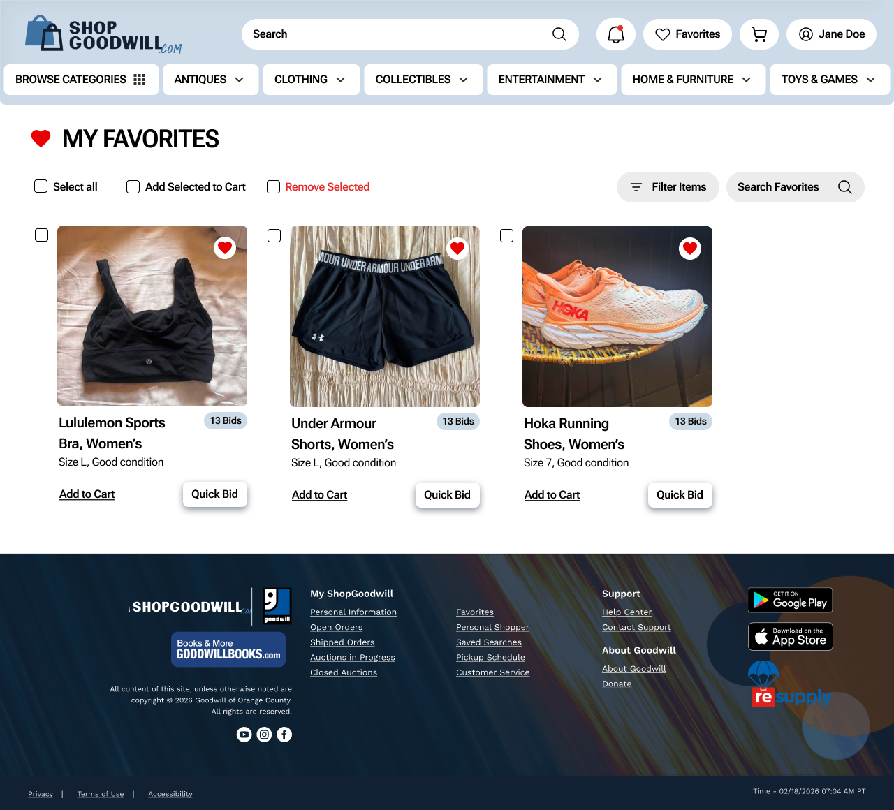
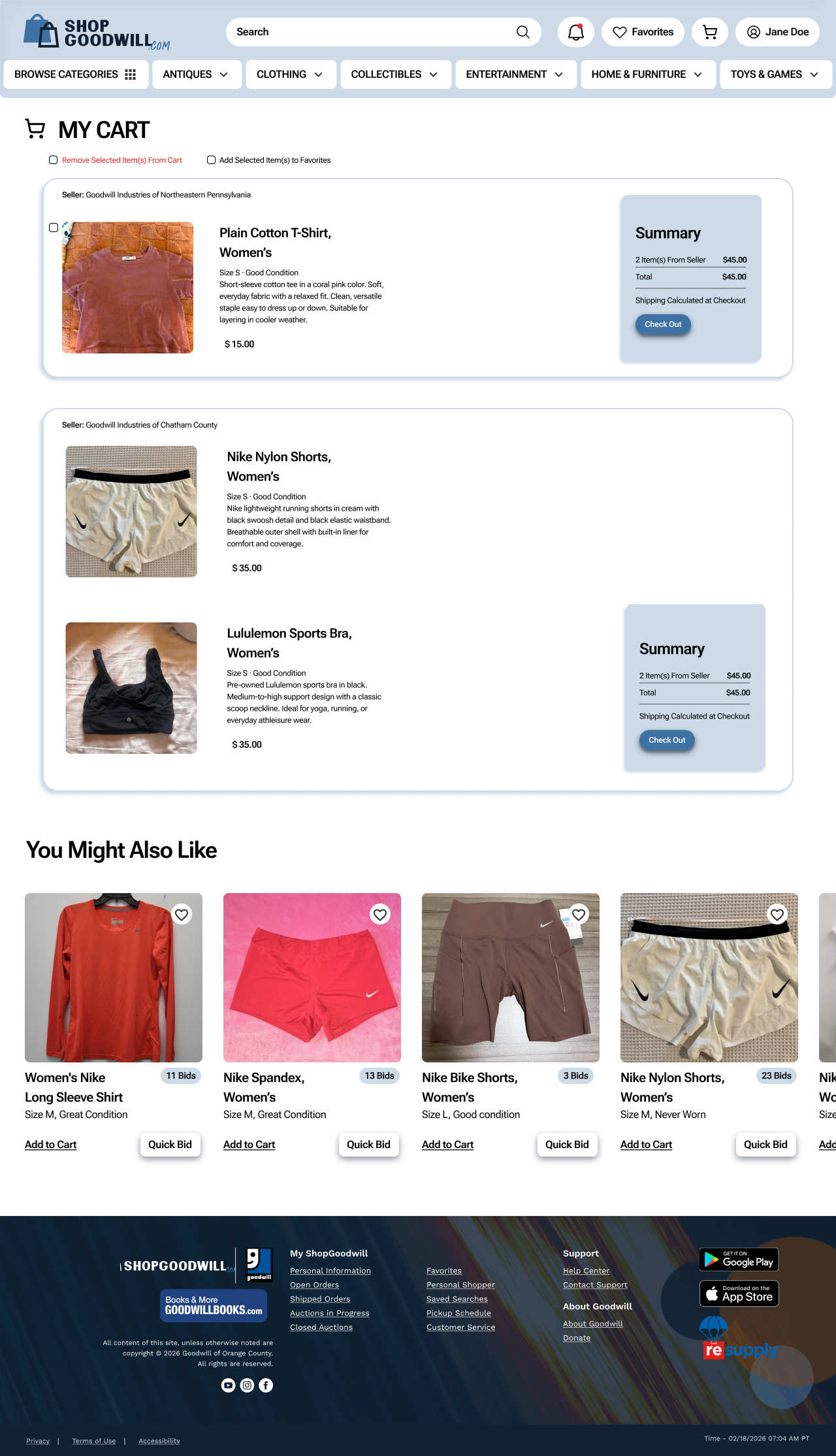
Favorites Icon time increased from 34.44 seconds to 68.66 in the unmoderated round, where all 8 participants added items to the cart before looking for a save-to-favorites option. The moderated group had been recruited from users familiar with heart-based saving, while the Maze pool skewed toward users whose mental model for "saving for later" was to add items to the cart. The redesign improved the experience for the heart-icon users, but we hadn't built interactions for the cart-first ones. The final iteration added an "add to favorites" option on the cart page, so users could save for later whichever model they brought.
The Favorites Icon problem was evidence of a mental model the redesign hadn't accounted for — surfaced only because the unmoderated round sampled a different population than the moderated phase.
Outcome
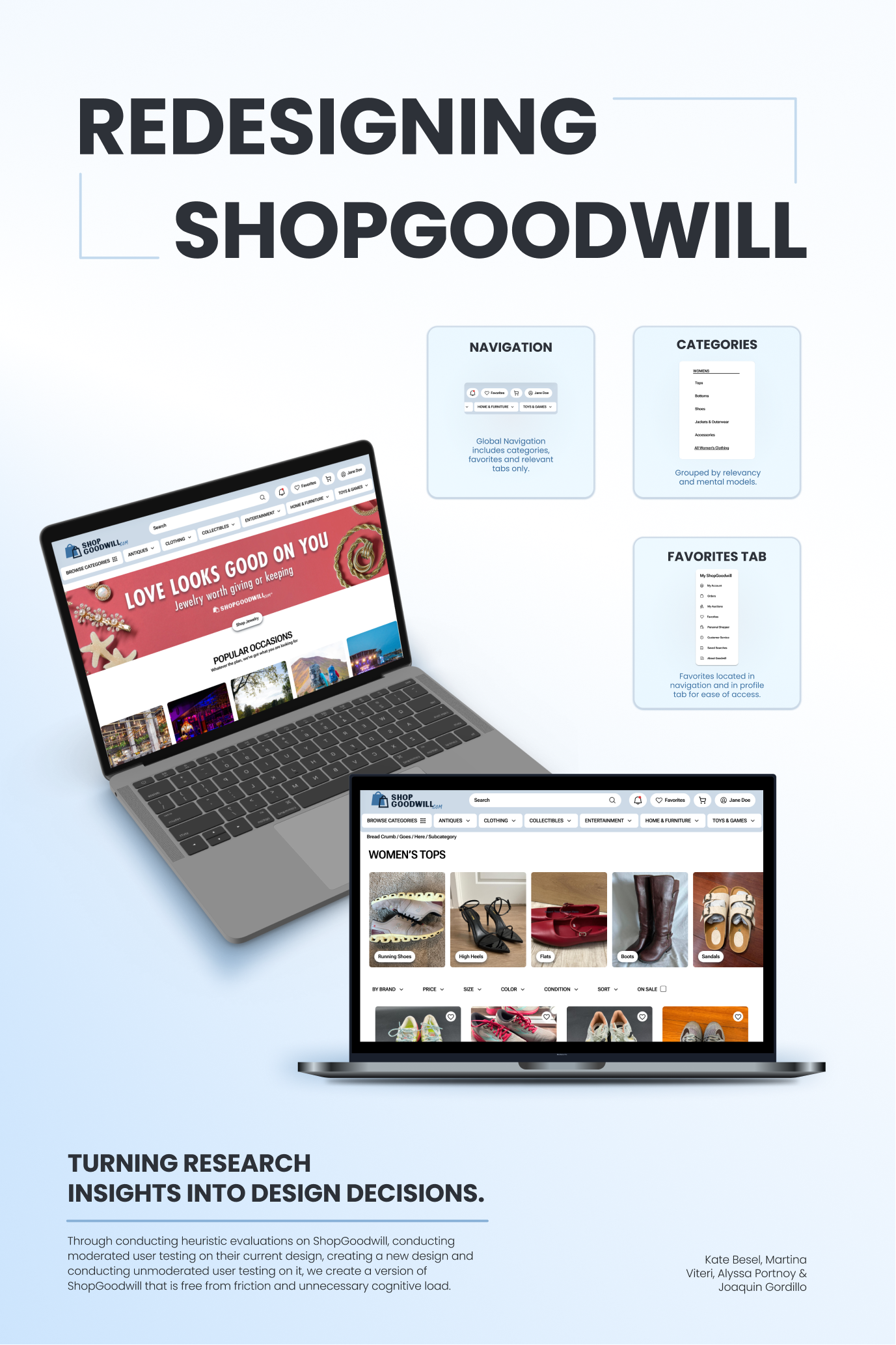
Two measurable wins and one reframe.
The Books decision produced the project's clearest data point — +75 percentage points in direct success, 41 seconds to 9. Time to locate the Favorites Tab dropped from 23.77 seconds to 2.5. Saving items for later regressed — but that exposed a mental model the redesign hadn't accounted for and let us design a solution that works for a larger population. The cart page, originally out of scope, became the home of a new save-for-later interaction.
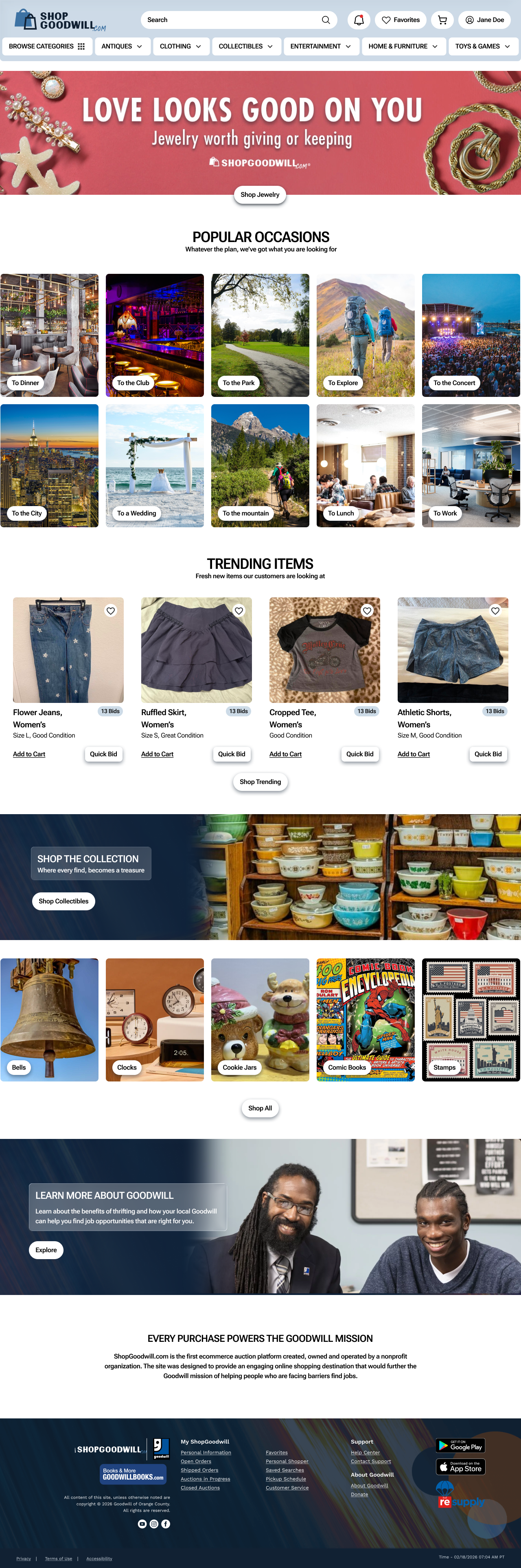
Phase 2 — Redesigned Prototype
Favorites in the global nav, a clearer heart icon on listings, and — added after the cart-first finding — a save-to-favorites affordance on the cart page, where the sampling-shifted group actually went.
Reflection
I'd build a more functional Phase 2 prototype before launching the unmoderated study. The non-functional cart page meant all 8 participants hit a dead end, muddying how cleanly we could read the cart-first finding.
TreeTest AI
Beta · Launching September 2026The tree-testing tool Drake Durflinger and I built for ShopGoodwill became the proof of concept for TreeTest AI — an AI-powered UX research platform we're building together. It's grown well past tree testing: card sorts, tree tests, and usability studies with AI doing the heavy lifting, plus an AI engine that scores a site's UX without participants. We're opening up a category normally gated behind $40k enterprise tools — free during beta, with the core staying free for students.
Visit TreeTest AI →